
Understanding why a currency is strong from a fundamental and technical perspective give traders a new perspective.
I will post the strongest and weakest currencies from time to time. It is just a snapshot in time. In fact, I include the time in the picture (7:52 AM ET).

You might wonder, what good is a snapshot of what has transpired? How can it help my trading going forward?
The answer to that comes from more work, but trading successfully often comes from drilling down from something broad to something more specific. This is one of those instances.
Before explaining what I mean, let me explain some things in the graph.
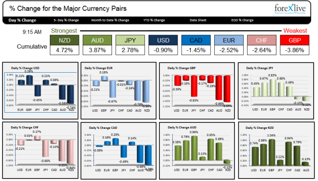
The Ranking of Strongest to Weakest.
The rank simply comes from taking the % changes of each currency (say the NZD) vs. the other major currencies from the close of business yesterday (at 5 PM ET) and summing those changes. So for the NZD (see chart above and a zoomed in look below), it is up 0.74% vs the USD on the day. It is up 0.86% vs the EUR, and 1.04% vs the GBP, etc. The sum of those individual numbers total 4.72%. (0.74+0.86+1.04+0.22_0.94+0.79+0.13 = 4.72).
I do that for each of the currency pairs individually (well my computer - with help from a direct feed of prices into an excel spreadsheet - does it for me). The highest number gets the distinction as the strongest for the day. The lowest gets the distinction of being the weakest. I will color code the strongest as dark green and the weakest as red - with varying shades in between (darker green to lighter green, purple, blue and light blue and light red and dark red is the progression).
You may note that the colors match from the Cumulative scale to the lower graphs. As a result if you want to know the weakest. Look for red bars. The strongest? Dark green with other gradients in between.
Also of note is that if the NZD is up by 0.74% vs the USD. the USD is down -0.74% vs the NZD. That makes sense. Currency moves are about one gain and one loss in equal but opposite directions. That also means if you were to add up all the changes, it would sum to 0.0% – and it does.

Close up of the NZD % changes vs other major pairs.
So what do you do with that information?
First off, I know the NZD is strong. Ok. Now the question becomes “Why?”
Well I might have a general understanding of what is going on in NZ, but maybe there was some news overnight that caused the move higher. So I look back and see what might have caused the move. In looking today, there was really nothing coming out of New Zealand economically.
Are commodities up? After all, the New Zealand dollar is influenced by commodity prices and they have been trending down (which should be bearish). Looking at the CRB index, not much change there.
I will also see if my colleagues at ForexLive had anything to say about the currency in the Asian and London session?
Lo and behold, Mike warned about the Dairy auction "Heads up for all you NZD traders – Global Dairy Trade auction today". Maybe that is an influence. The last auction was higher. Maybe the market is anticipating another increase. At least I now know of the risk from the auction.
From there, I can drill down into some of the charts. Well, I don’t often trade the NZDGBP which is up by 1.04%, but what about the NZDUSD? It is up 0.74%. What is the chart telling me?
So I will go to the chart and see the following picture.

NZDUSD/Hourly chart.
First off, the chart is saying up and down choppy. It also tells me that the price moved sharply lower last week and fell below a trend line (bearish), but it bounced yesterday and again today (rejection of the break. bullish).
What else is it telling me?
Well., I use the 100 and 200 hour MA (blue and green lines) in my technical analysis. What do I see from those MAs?
I see the NZDUSD bouncing against the MA levels on a number of occasions. I like to trade against levels that define and limit risk. These two moving averages do just that.
When I see this it makes me think that maybe there is a trade setting up. At least I know that “the market” is paying attention to this level. So although higher and the strongest currency of the day, there seems to be some overhead resistance. I can sell against it with a stop above.
Alternatively, I can wait for break above – after all the pair rejected the fall below the trend line yesterday. If it breaks above, what was once resistance, now becomes support. The 100 and 200 become my line in the sand for a potential trade.
What about that dairy auction result?
The auction result is a event risk for this trade. Maybe that is why the price rise has stalled against the 100 and 200 hour MA. It may be worthwhile to wait and see the results and then trade against the 100 and 200 hour MA. If the results are weaker/more bearish, I can say the price of the NZDUSD should not trade back above the 100 and 200 hour MA (my risk).
Conversely, if the number is stronger/more bullish, I can say, the price should not trade back below the 100 and 200 hour MA (my risk). The trend higher continues.
From there it is up to the trading gods (i.e. the flows) to determine if it is a winner or a small loser. What I know from my analysis, however, is “the market” is paying attention to the 100 and 200 hour MA. As a result, so will I. It becomes my “line in the sand”. My risk defining/risk limiting area.
They type of analysis can be done for any pair against the NZD.
The lesson is that in trading, if you can take a concept of fact – like the strongest and weakest – and then drill down into what makes it so from a fundamental and technical perspective, you may find trade opportunities that give you an edge.
That edge should lead to a trade plan that includes defining and limiting your risk in the process. From there you are on your way to more success by keeping losses to a minimum and hopefully riding a trend in the process.

