
It's not that bad
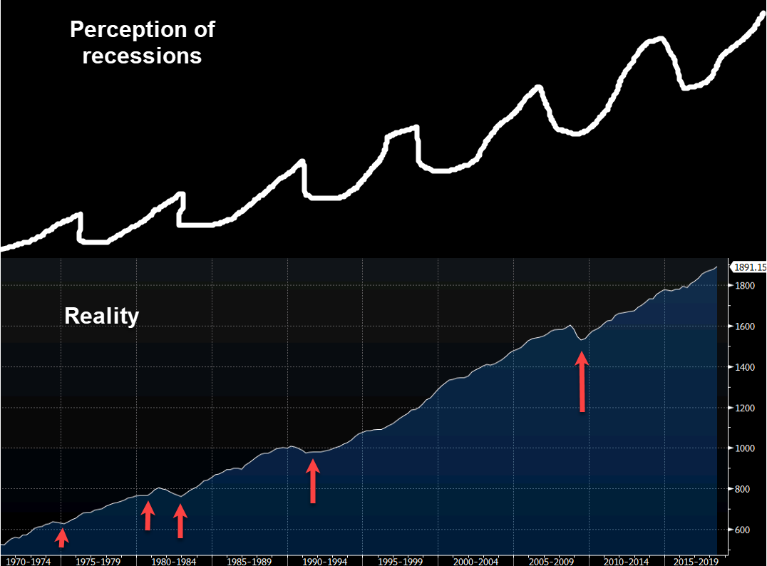
I posted a part of this chart earlier but here's a longer version. It shows Canadian GDP for the past 50 years. It's similar in most of the world.
It's beautiful chart going from the lower left to the upper right with some tiny dips.
I feel like the perception of growth is something far different.

I don't know if it's the scars of the crisis or the experience of a few outliers like Italy and Spain but the reality is that recessions are bumps in the road. Yes, for some people who lose jobs/careers it's heartbreaking but as investors we see recessions as these mythical dragons to be feared but they're more mosquito than monster.
As investors and traders, recessions are incredible opportunities to find mis-priced markets and if you have a longer view and a steady hand then your path -- like this chart -- will be higher.

