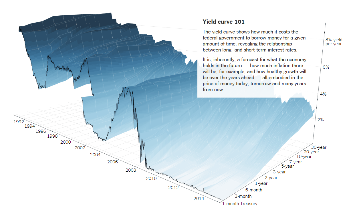
The yield curve in 3D
The New York Times is out with a great graphical explanation on the yield curve 101.

I constantly see traders in FX and other markets who are mystified by bonds. They see prices quoted at 98-29+ and see prices moving inversely to yields and then try and forget about the whole thing.
The post doesn't explain any of the fine points but it's a beautiful introduction to the signals from the yield curve.


